For this update we're going to touch on small adjustments as they relate to the Opponents deck, but more than anything this is a way of sharing more about visual presentation and design. Many of the previous changes we've seen in this area have been revealed in the recent updates to the Adventure and Dungeon card decks, where (for example) serif fonts have been replaced by styled handwriting fonts, with far greater emphasis on the narrative presentation that has become the central basis for characters and player storytelling.
As we sat down to consider these changes the Opponents deck presented a good opportunity as a point of reference, with the idea that each deck inhabits a unique visual style, but also where changes might be influenced by the shift in focus of recent years. Those familiar with layout and design know there are many factors that inform the choices and combinations that go into something like a font palette, which can be a lengthy process with respect to crafting the appropriate look and feel. But with an iterative development process, as we're doing here, has allowed each element to evolve in its own way, resulting in things that quite possibly might not have occurred otherwise.
None of the characters (or their fighting abilities) have been changed, which means that if you have the previous version it is still mechanically a fully up-to-date deck. This might be the first time an update has been purely aesthetic. Although that said, we did capitalize on opportunities for additional wordsmithing, which rather than artwork is used to bring the characters to life.
Here's a quick preview of what the new design looks like...
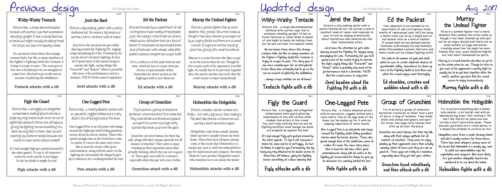
The other thing we've been wanting to do for some time is revisit the color for the Opponents backing. No major change but we did increase the saturation just slightly. In fact, for most printers it will hardly be noticeable, but whatever the case you should be getting something like a Grayish purple or a Light plum.

There are of course more changes in the works, although possibly not quite what you will think... at least, not for the next update. As always, we want to thank all of the families, individuals and groups of players out there for giving this game a chance. It's no small thing to go through the effort of putting something like this together let alone keeping it up-to-date, when there are so many other games out there available in a nicely decorated box on a store shelf.
...maybe someday.
 RSS Feed