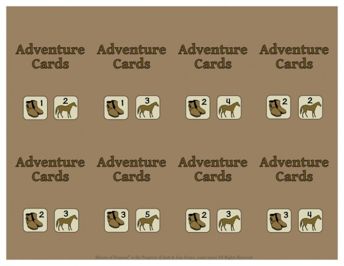
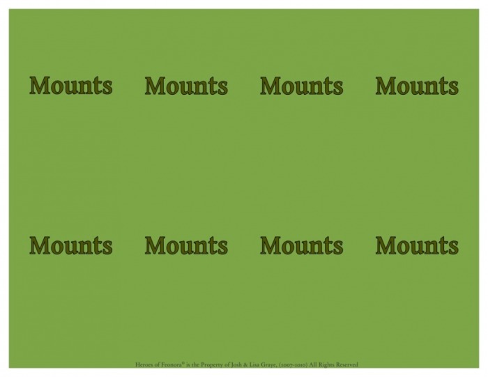
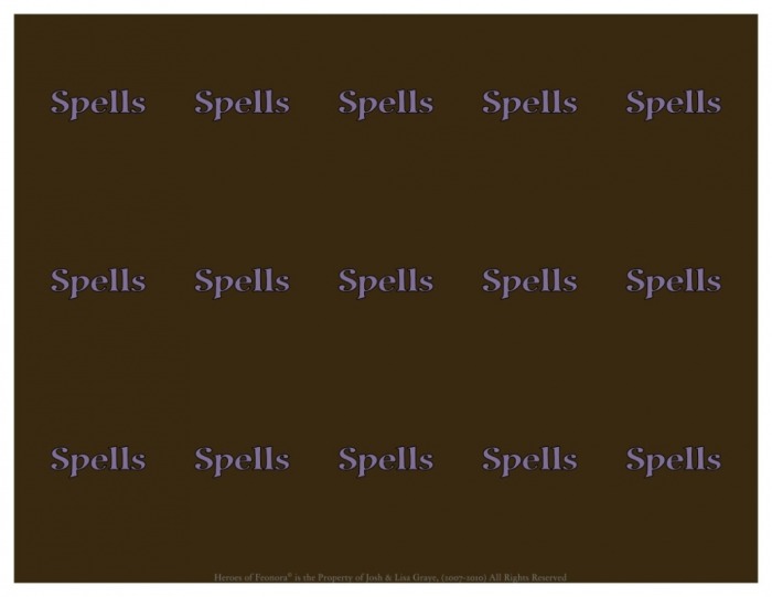
Perhaps a little background is in order here. The original idea for the color card backings was to keep it simple. The field would remain white, with a simple brown for the font... a slight variation on the gray/white combination used for the grayscale decks. The intent was to help with keeping ink & toner use as low as possible. But there was one fatal flaw in that plan. When designing a game, one has the tendency to constantly be thinking about ways to improve the design...
One day, while pondering over our latest prototype (with white cards positioned around the more colorful game board), this small notion of adding a touch of color to the cards began playing in my mind. The idea was to somehow reduce the disparity between a delightfully colorful play area and the decks situation around it. In the spirit of simplicity we settled for a heavily subdued earth tone, keeping the previously used brown font. This was a pleasing change, not seeing white card backings, and felt satisfying enough for several weeks. Until one day...
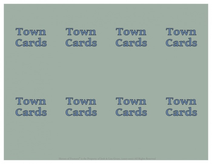
Josh was working on the Town Timer, and felt that maybe, just for this one deck (it being separate from the others and all) we could choose a unique color scheme. That done all was well once again, and shortly thereafter the game was released in the form of a print-and-play style game.
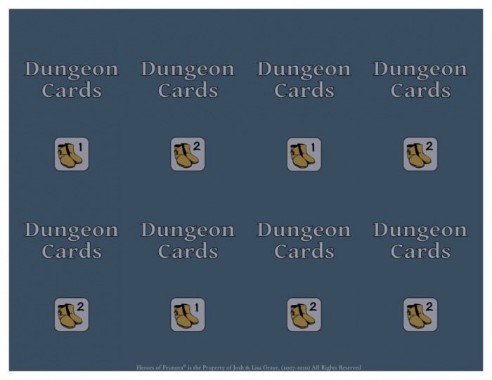
Of course, once we'd designated a unique color for the Town Card deck we couldn't resist experimenting with the Spells deck and...
One day, while pondering over our latest prototype (with white cards positioned around the more colorful game board), this small notion of adding a touch of color to the cards began playing in my mind. The idea was to somehow reduce the disparity between a delightfully colorful play area and the decks situation around it. In the spirit of simplicity we settled for a heavily subdued earth tone, keeping the previously used brown font. This was a pleasing change, not seeing white card backings, and felt satisfying enough for several weeks. Until one day...
Josh was working on the Town Timer, and felt that maybe, just for this one deck (it being separate from the others and all) we could choose a unique color scheme. That done all was well once again, and shortly thereafter the game was released in the form of a print-and-play style game.
Of course, once we'd designated a unique color for the Town Card deck we couldn't resist experimenting with the Spells deck and...
...well, you can probably guess where this is going.
As you can see below the card backings have developed into a color palette all their own, which we're feeling pleased with for the time being, and hope you will be too.


 RSS Feed